It's bright red - with black hob and ovens. The work surface will be pale grey, although we'd love to have had dark but it's quite a gloomy room with very little light. This photo gives an idea of what it'll look like. (See:
http://www.ikea.com/gb/en/catalog/categories/departments/kitchen/designideas/20144_conk05a/#room/20144_conk05a and http://www.theoffiz.com/modern-red-kitchen-cabinet-design-ideas/)
We are having units all down one side and the opposite side with be housing for fridge, ovens and storage, with a peninsula for companionable chats whilst I'm cooking. It also means in my grand daughter wants to have her tea whilst I'm busy we can see each other.
See:
http://www.ikea.com/gb/en/catalog/categories/departments/kitchen/designideas/20144_conk05a/#room/20144_conk05a
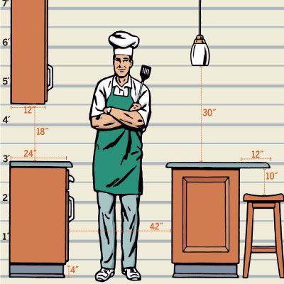
When we were considering a new kitchen and one of the first questions, as a short person, was what height should be cabinets be? Here is a helpful diagram:

These measurements look as though they've been designed for the 'average' person (whatever that is!). Our current kitchen cabinets at rather high, then adding the height of the gas hob, it makes it very difficult for me to make stir-fries. So we're thinking of having a thinner than usual work surface - 2.8 cm rather than 3.8cm and also having an electric induction hob, keeping things as low as possible.
1 The critical point is that for a fitted kitchen to look fabulous you need a fabulous fitter. Do your research and take references; you will be rewarded.
2 Keep things simple. The most visually pleasing arrangements of cabinets consist of runs of either wide, deep drawers, or runs of floor-mounted cupboards only. But don’t mix the two in one run – it can look a mess. Likewise, beware of a jumble of full-height and wall- and floor-mounted units. Symmetry is your friend.
3 Never site an extractor fan between wall cabinets: it looks clumsy. Instead replace adjacent cabinets with open shelves. If the thought of all that dust brings out your OCD, conceal a canopy hood inside an adapted wall cabinet that has no bottom, rendering the appliance virtually invisible. By the way, the cheaper extractor fans are often made in the same factories as those that are more expensive, so it may not be worth spending a great deal of money on one.
4 When selecting your appliances, choose carefully. Forget about expensive brands, just buy basic white goods with an A+++ energy efficiency rating. These can be concealed behind cabinet fronts to match the rest of your kitchen.
5 When it comes to slick modern kitchens, the key word is concealment. Undermounting a cheaper stainless-steel sink into your worktop will make it look more stylish and more expensive
6 One design trick is to fit the plinth (the ‘skirting board’ that floor units sit on) as far back as is possible. This will make your joinery appear cantilevered and ‘high-design’.
7 Spend your money where it counts most. Buy inexpensive carcasses from big DIY stores, Ikea or kitchen specialists such as Howdens and then have them fitted with bespoke doors and drawer fronts.
8 A worktop is one of the most visible features so it is well worth spending money here. Honed granite (which has a flat low sheen without reflection) is both chic and durable, making it cost-effective too. To keep your top relatively lightweight order a slab that is about 20mm thick but ask for a mitred downstand (edging) of 70mm. This will make it look luxuriously thick. Consider using the same material for a splashback or choose painted glass.
9 Kitchen taps need to be good quality, but don’t go mad. Hansgrohe is ideal.
10 Sleek, modern kitchens are often ironmongery-free zones which makes them budget-friendly (beautiful handles and knobs are frequently a ‘hidden’ cost). The company Hafele (hafele.com) makes good-quality fitted closers and push catches. You can also have cupboard doors and drawer fronts constructed with integrated handles.
Ideas for kitchen use:
http://www.furnitureproduction.net/news/articles/2013/09/1286143642-uk-real-life-kitchen-study-findings-announced
http://www.furnitureproduction.net/news/articles/2013/09/1286143642-uk-real-life-kitchen-study-findings-announced
Three key ideas for your hall:
Have a focal point
Add something which shows your personal style
Play with colour, it's not a room you're in all the time so ...
No comments:
Post a Comment