
I can still picture myself as a youngster sitting with my mother in a large darkened cinema, watching the movies. It was thrilling! At the time my favourites were colourful period pieces and Hollywood musicals, and I remember thinking that the serious dramas were (and still are to a degree) always in black and white.

Films in Technicolour were invariably lively and exuberant, wherreas murder mysteries and documentary films about poverty or hard times were shot in black and white. It's almost as if people though that colour was more frivolous than white, black and grey.
Certainly, when the fashion for minimalism was at its height, architects and interior designers would have had us living in white houses, furnished with perhaps a black leather couch and one grey painting. To be surrounded by colour was in some way undiscerning or flashy.
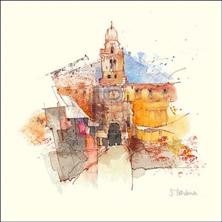 |
| Padua |
In a real sense an artist does not have that choice; one is not free to decide what one does best, which may well turn out to be different from what one imagined. It came as a something of a surprise when I found myself painting with bright colours instead of concentrating on black and white. Nevertheless, neutrals are important for creating atmosphere and diversity in my paintings.
No comments:
Post a Comment